Button block
Button block
The Button block adds a clickable call to action with your own text, link, colors and optional icon.

Main settings
- Link: the URL the button opens, with an option to open it in a new tab.
- Size and width: preset or custom size, padding and full or fixed width.
- Fill type: filled or outline style, with normal and hover colors.
- Border and shadow: border, corner radius and box shadow for normal and hover states.
- Icon: add an icon, set its position (left or right), size and gap.
- Typography and alignment: font settings and button alignment.
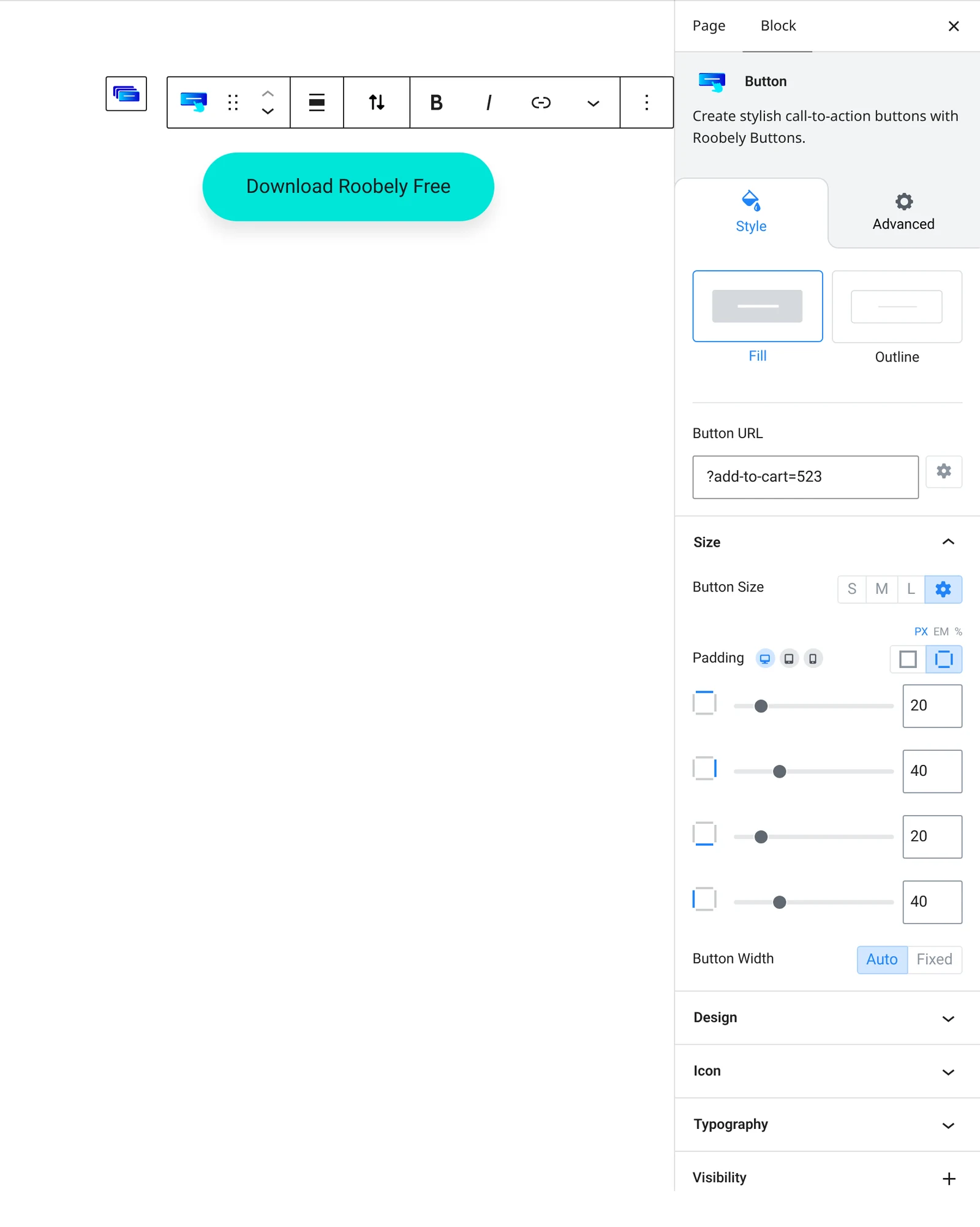
How to add it
- Open the page or post in the block editor and click the + (block inserter) button.
- Search for Button and choose the Roobely Button block.
- Type the button text and set the link in the toolbar or sidebar.
- Choose the fill type, colors and size, and add an icon if needed.
- Click Update or Publish, then preview the page to check it on desktop and mobile.